How long should a design case video be?
There is no single right number of seconds. The right length depends on where the video plays and how much it has to show. Here is how to set it: by the place, by the stops, and by what you cut.
Free on Figma Community · 3 free exports · no watermark
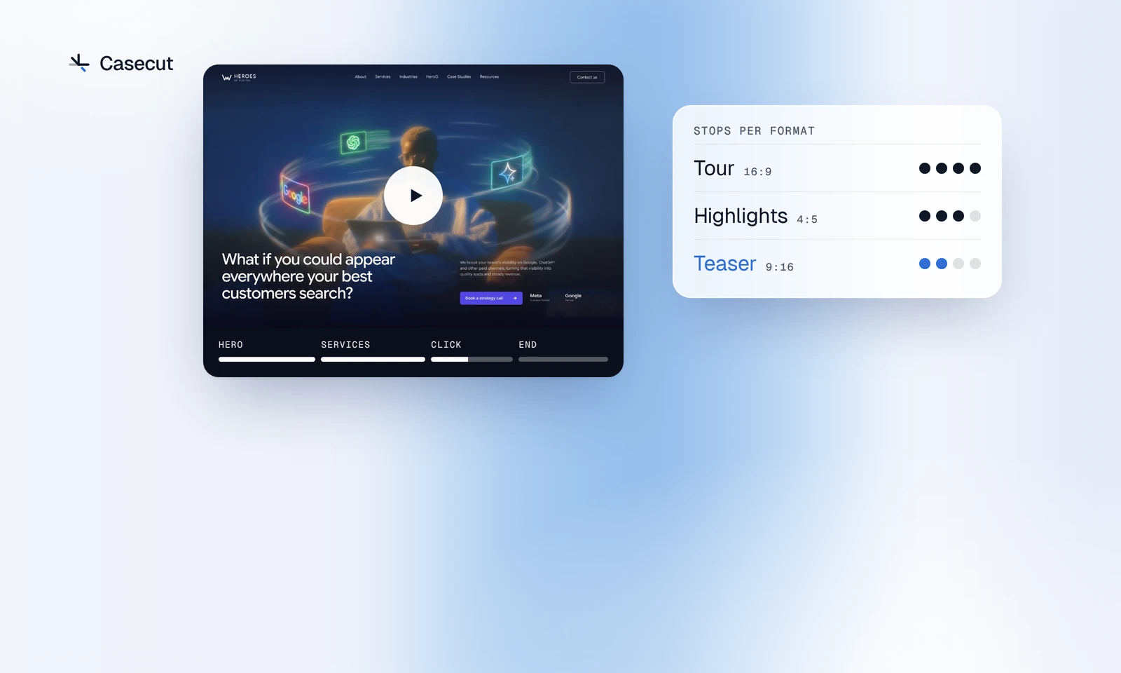
The place sets the length, not the page
A finished landing page can be long, but nobody watches a video because the page is long. They watch because the first moments made them curious. So start with where the video will play, and let that decide how much of the page goes in.
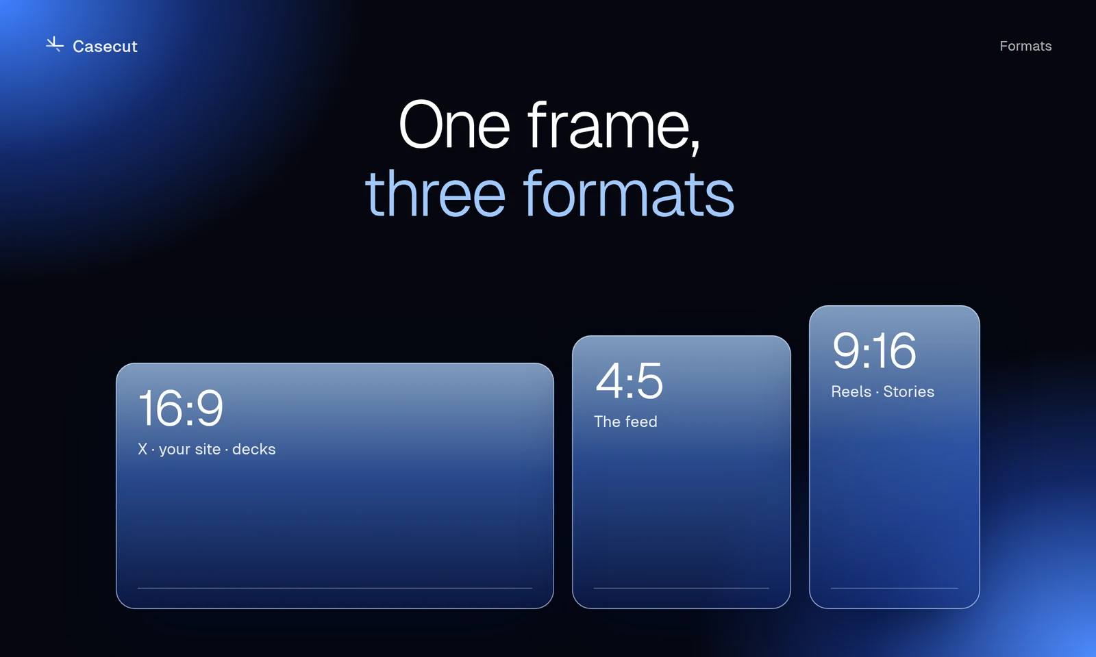
| Where | Who is watching | How much of the page | |
|---|---|---|---|
| 16:9 | Your site, the top of a Behance project, X, LinkedIn, a client call | Someone who chose to open the case | The tour: the strongest sections in order, with a click |
| 4:5 | The Instagram and LinkedIn feed, a Dribbble shot | Someone browsing | The highlights: two or three sections |
| 9:16 | Reels, Stories, TikTok, Shorts | Someone swiping | A teaser: one idea, short enough to loop |
People who opened the case have already given you their attention. People in a feed have not yet. The further the video plays from the case page, the shorter it should be.
A call with a client is the exception. There you can show the whole page and talk over it, because the client has set the time aside for it.
Count stops, not seconds
Seconds are hard to plan while you look at a Figma frame. Stops are easy. A stop is a moment where the camera rests on a section long enough to read it. Everything between two stops is travel.
- The first screen is always a stop. It is the cover of the video.
- A section with a headline worth reading is a stop.
- A section that repeats a pattern you have already shown, such as a second card grid or a logo strip, is travel at most.
- One press of the main button is a stop of its own: the cursor needs a moment to reach it, show the hover and press.
- The ending is a stop: the page at rest, or your name and how to reach you.
Give each stop enough time to read its headline, and keep the travel between stops brisk. A video that feels long is rarely too slow. It usually has too many stops.
What to cut first
- Repeats. A second section built the same way as the first adds length, not information.
- The footer. Links and legal text are not why anyone watches. End before them, or let the camera pass through.
- A slow start. If the title card adds nothing, turn it off and open on the page itself.
- Extra clicks. One press of the main button shows that the design works. Pressing similar buttons again repeats the point.
- Holds that wait too long. Trim the pause and keep the shot.
After each change, watch the cut once more with the sound off, the way most people in a feed will see it. If it is still clear what the project is and why it is good, the length is right.
The first frame and the last
In a feed the first frame works as the cover, and many people decide right there. Open on the strongest screen you have; for most landing pages that is the hero. The last frame stays on screen when the video stops or starts again, so make it worth looking at: the page at rest, or a button with a clear call to action.
Setting the length in Casecut
In Casecut the AI director makes these choices for the first cut. It writes the storyboard: which section gets time, which one the camera glides through, what the cursor presses. The three formats come out of the same project at different lengths, and the vertical cut is the shortest, because each one is directed for its own screen.
Take the Heroes of Digital homepage, an AI SEO agency page. A good tour has four stops: the hero, the services, a press of the Book a strategy call button, and the ending. A good teaser keeps two: the hero and the press.
When the cut is longer or shorter than you want, change it:
- Tell the director in the chat, for example "Make it shorter" or "Stay longer on the first screen".
- Open the menu of a block on the timeline to change it, and move a cursor click or switch it off.
- Turn the title intro off to open on the page itself.
- For a Dribbble shot, export in 1080p: shots take an MP4 of up to 20 MB.
The music is written for the project too, with its own key, chords and tempo for its length, so the sound does not stop in the middle of a phrase.
Video for Behance and Dribbble, from a Figma frameTry it on your own frame
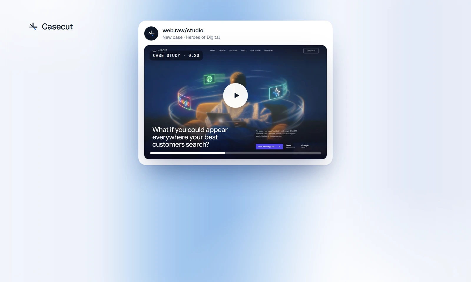 Behance and Dribbble videoThe right format and length for a project or a shot.OpenUse case
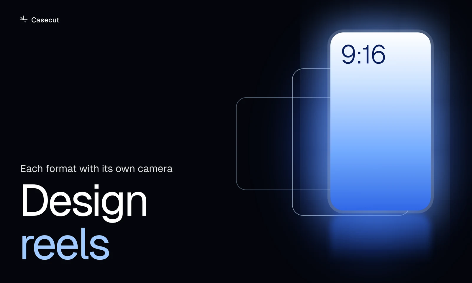 Design reels9:16, 4:5 and 16:9 from one frame, each with its own camera.Open
More from the blog
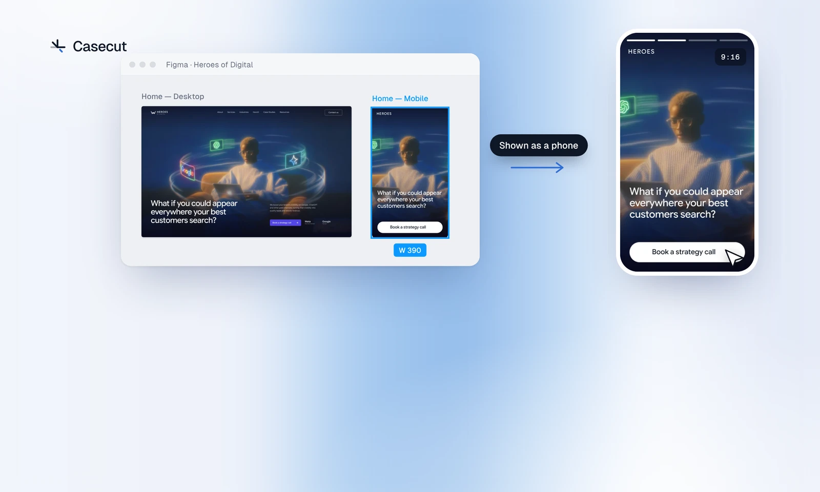 Mobile design in a videoThe frame to send, a phone on the stage, and the format for each place.3 min readOctober 14, 2026
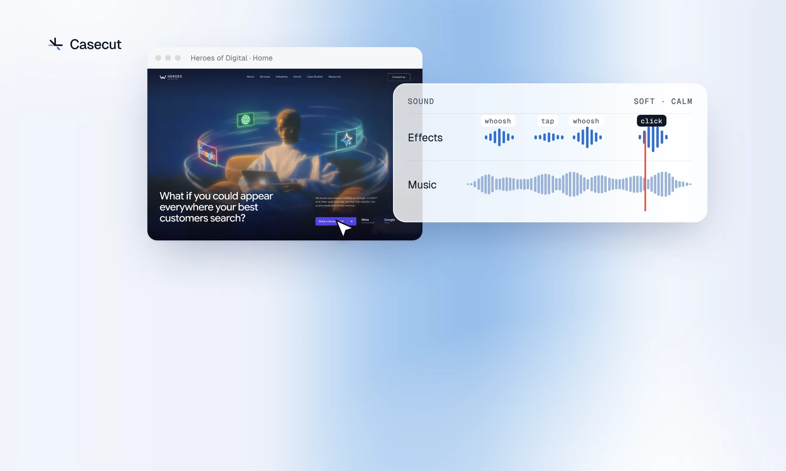 Sound for a UI videoWhich sound goes with which move, and where the music sits.3 min readOctober 7, 2026
 Figma prototype to video: four waysScreen recording, After Effects, motion tools and an automatic walkthrough.2 min readOctober 7, 2026
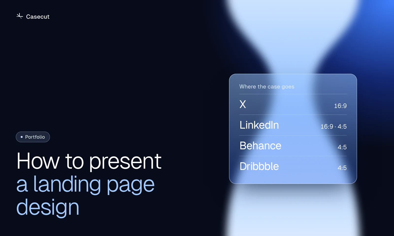 How to present a landing page designA practical structure for Behance, Dribbble, X and LinkedIn.2 min readOctober 7, 2026
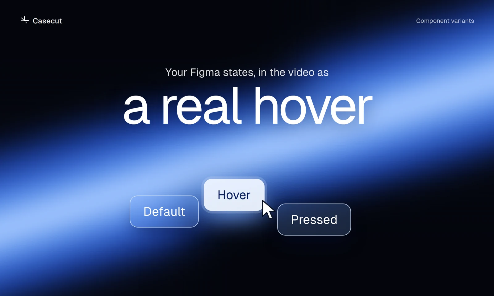 Figma hover states in a videoSet up variants so buttons and cards show their real hover.2 min readOctober 7, 2026
 16:9, 4:5 or 9:16 for a case videoWhich format goes where, and why a crop is not enough.2 min read